BE LOVE
I was tasked with giving the Be Love brand a sleeker, more refined appearance, all while keeping its Christian roots intact in a way that felt inclusive to everyone. It was a delicate balance. My challenge was to create a design that struck the perfect harmony between simplicity and creativity, ensuring the logo remained recognizable and appealing to a broad audience.
THE IDEA
I fused the essence of love, reflected in God's purest form, with the symbolic power of threes, deeply rooted in biblical significance, and the "B" from the "BE LOVE" company into one cohesive symbol—a bee. Inspired by how Christians share the gospel, much like bees cross-pollinate flowers, returning to their hives representing the body of Christ. This bee symbol isn't just versatile; it's a testament to our commitment to spreading love in various forms, standing strong on its own, or complementing diverse patterns and apparel.
Roles: Logo/Brand Identity Design, Art Direction, Creative Direction, Packaging Design
Tools: Illustrator, Photoshop, InDesign, Procreate, iPad
Art Director & Creative Director: Shaun P
Designer: Shaun P
Junior Designer: Rafaela Knight
Copy Writer: Shantea Strong
SPECIAL EDITION ASSETS
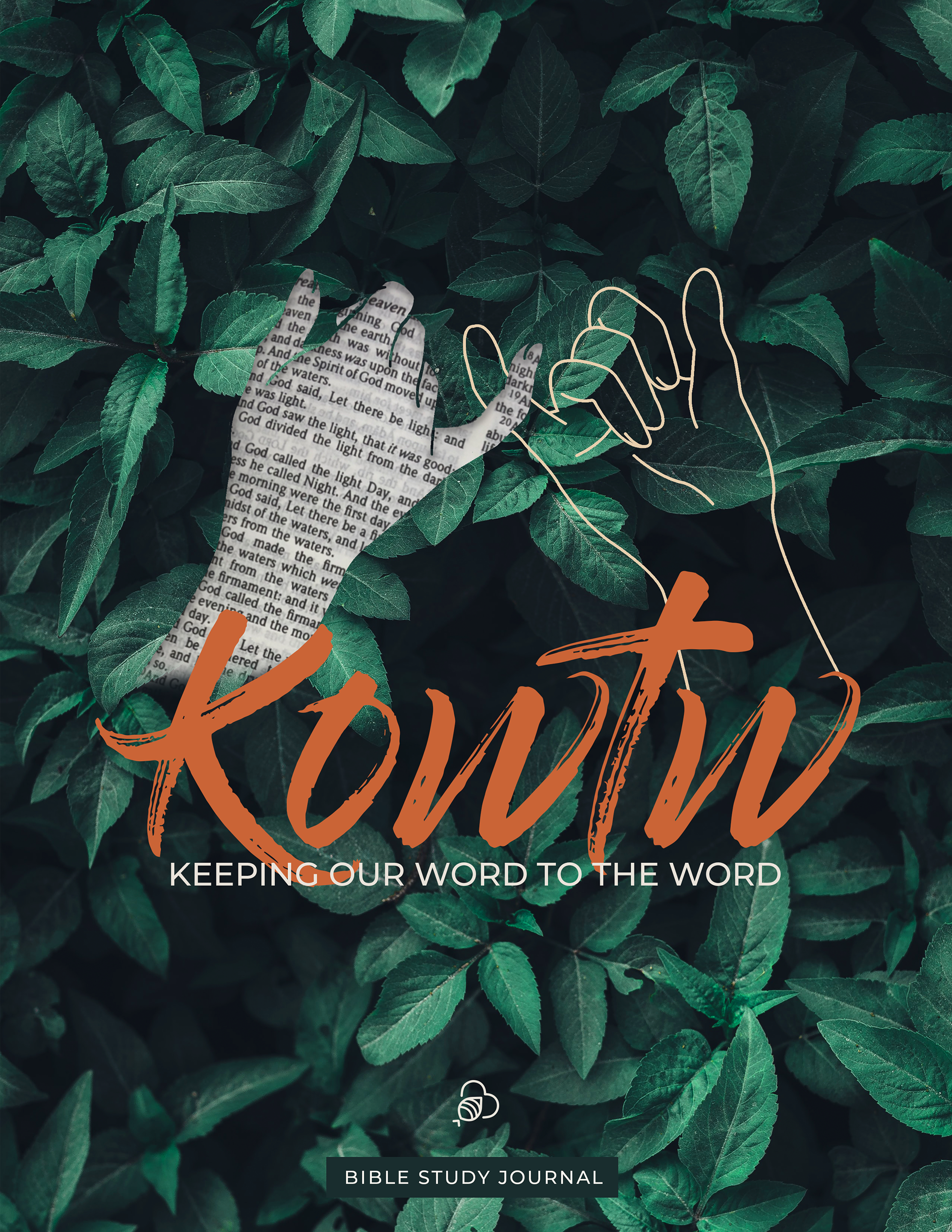
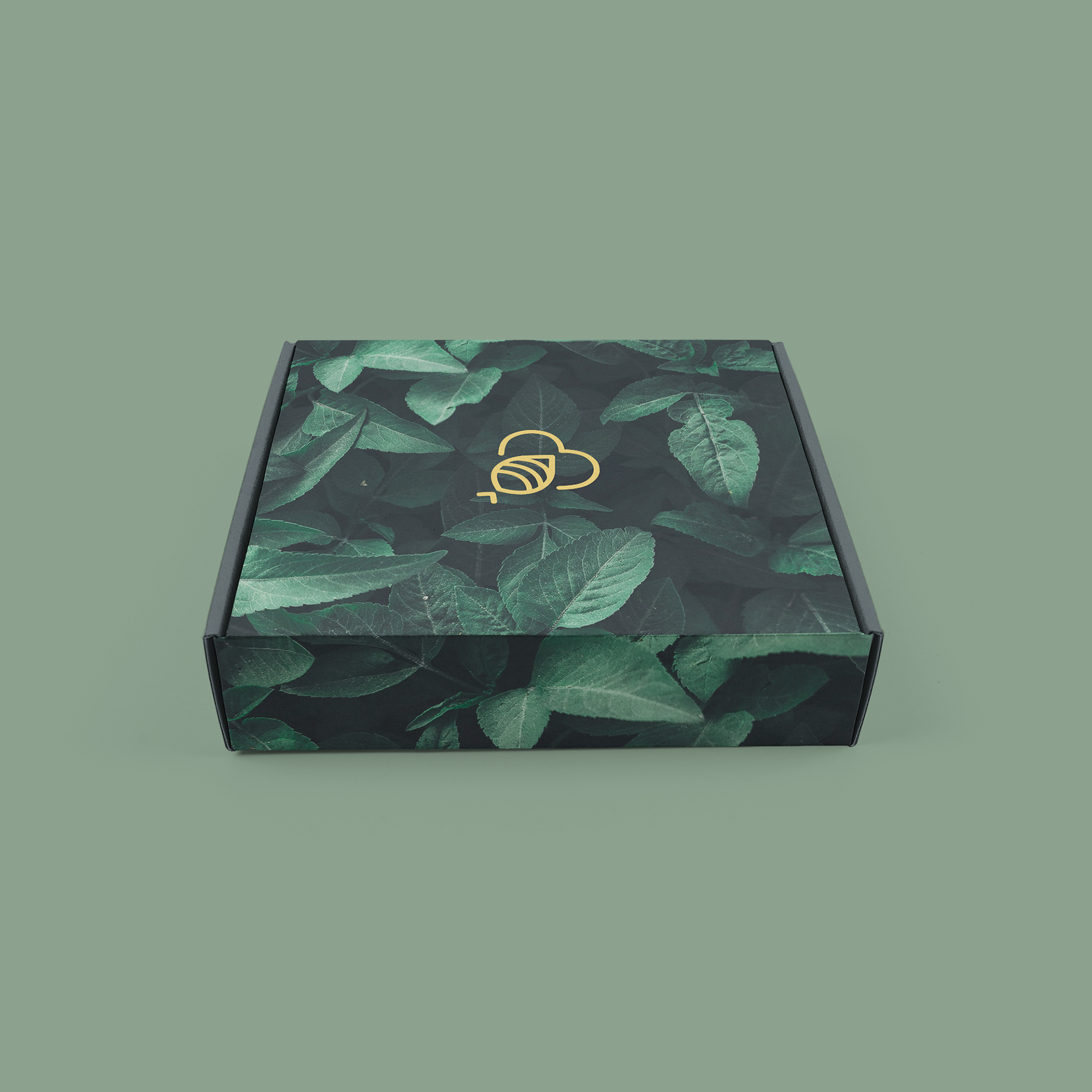
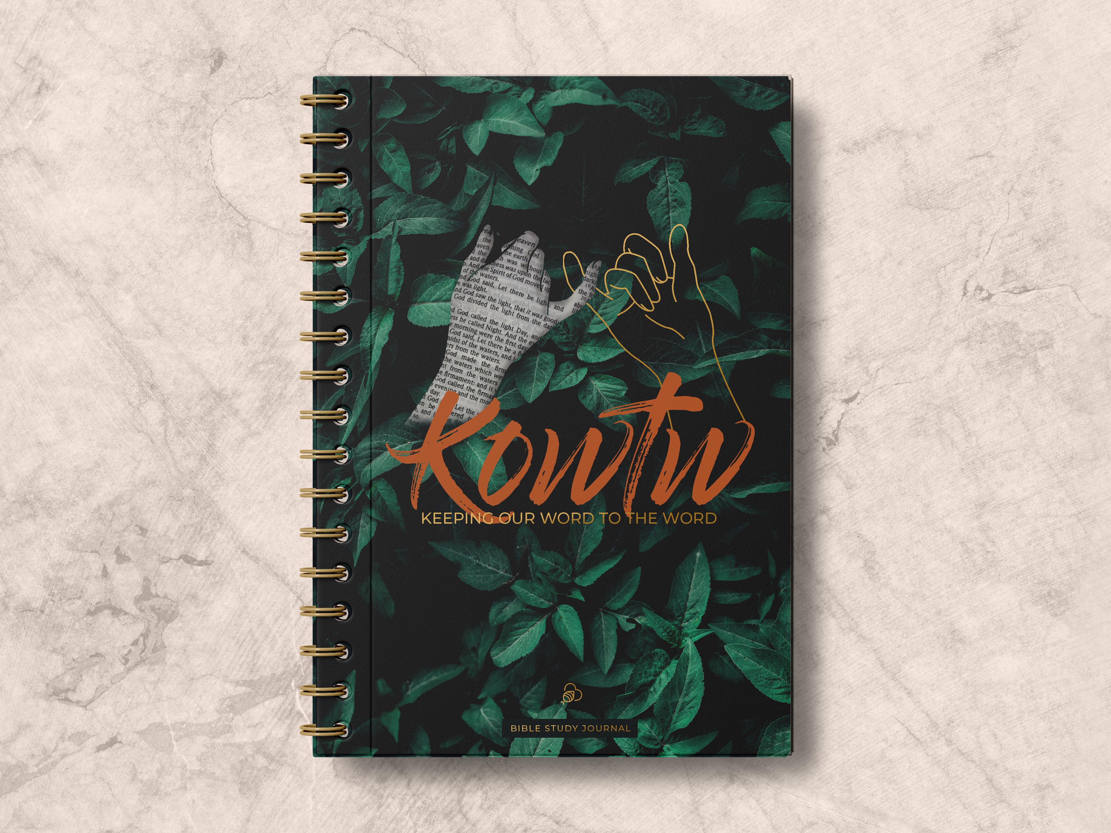
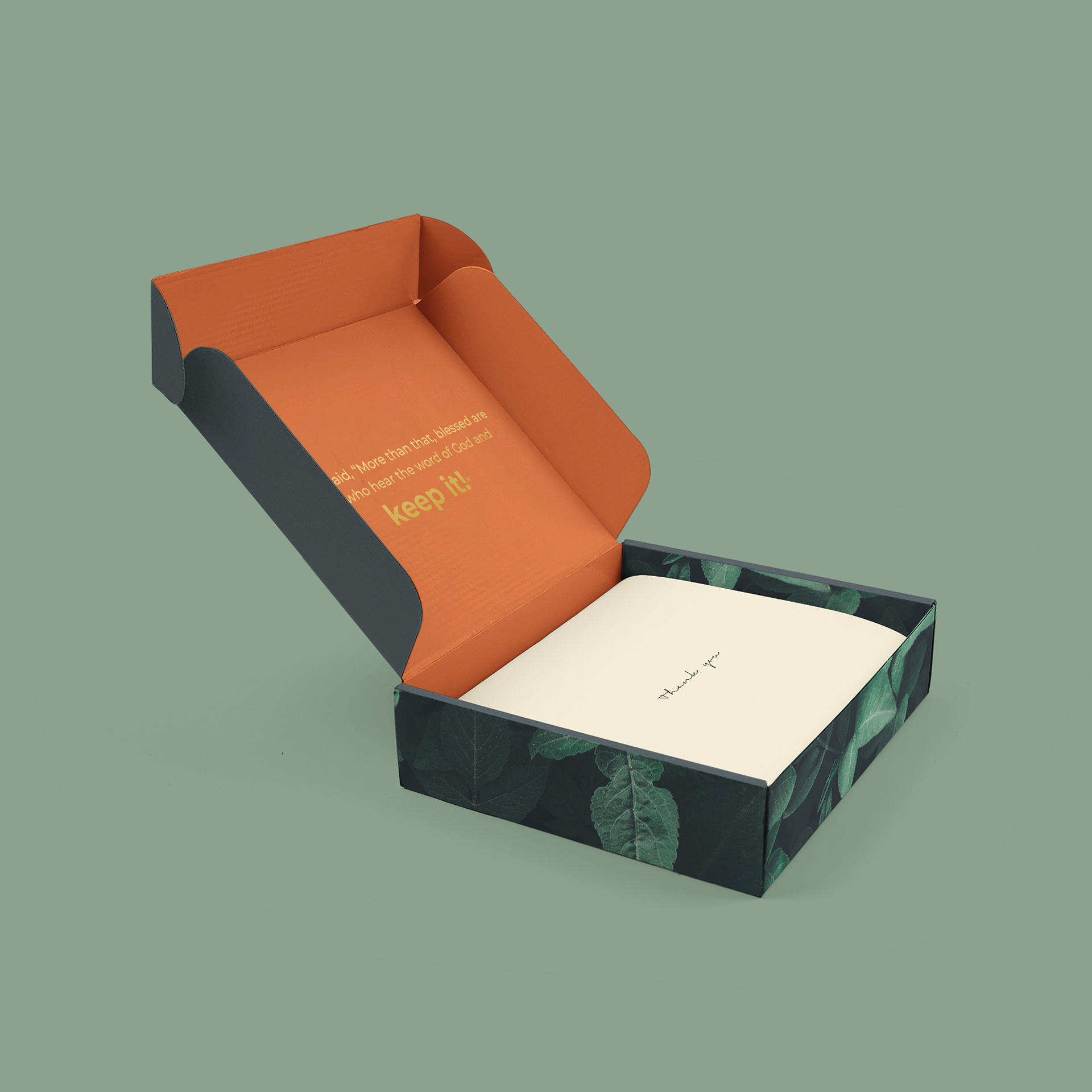
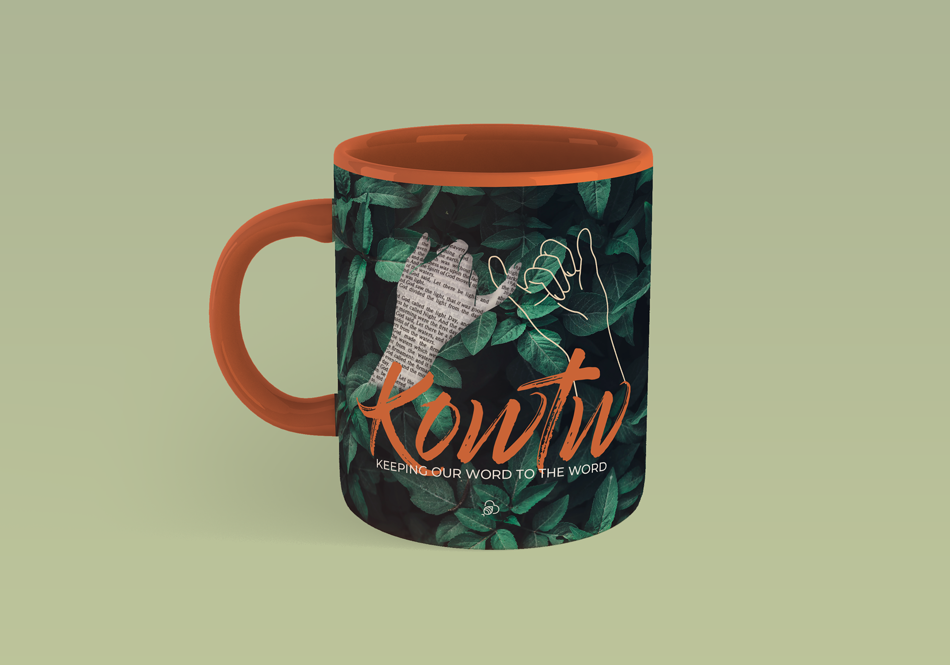
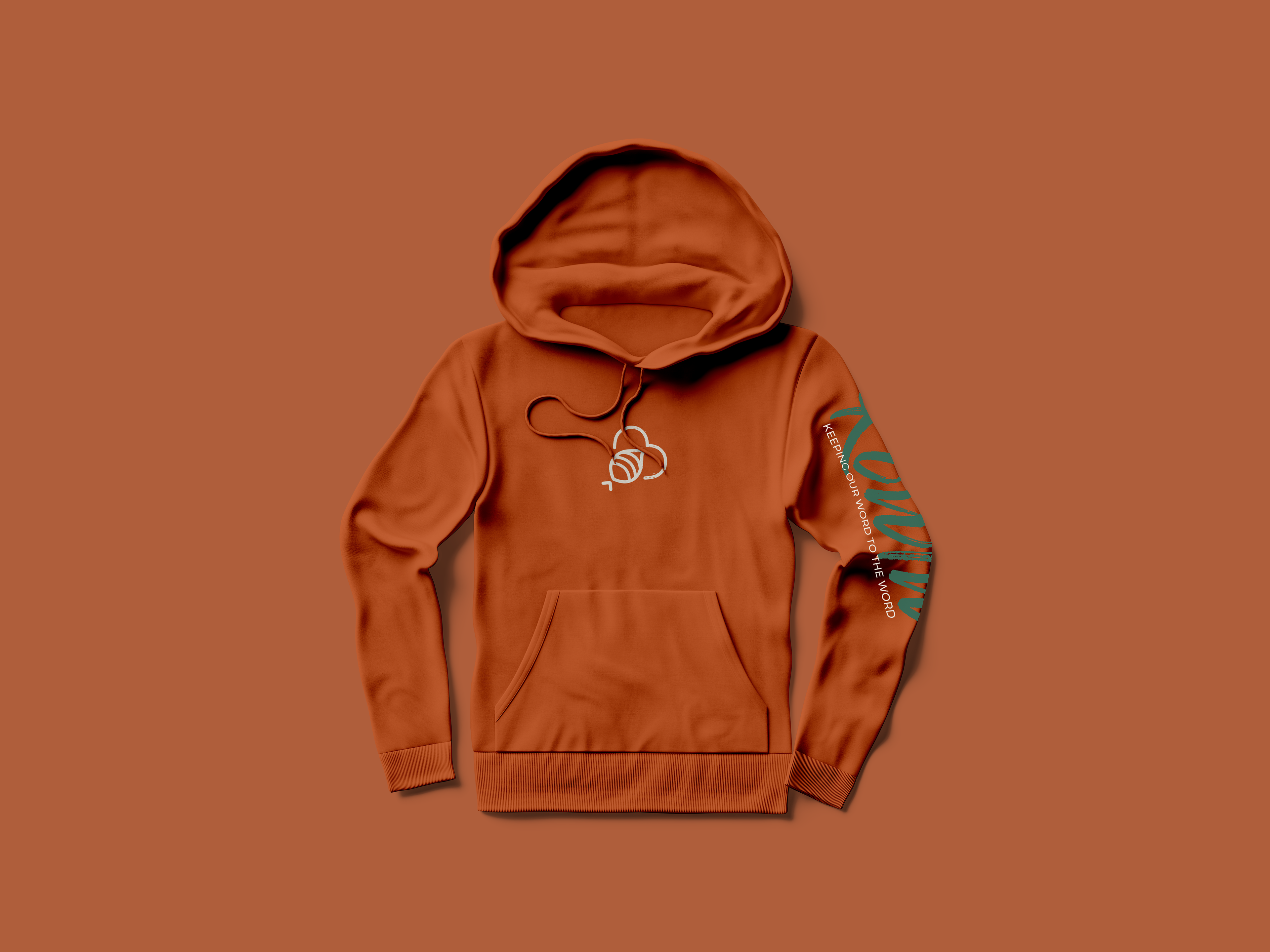
These designs were part of a collection launched by the company. This was part of a limited campaign that included apparel, packaging, and merch crafted as one package.
CARD DESIGN
